mOS by Kochava

Workspace 1
Workspace 2
Workspace 3
Company configuration
Product 1
Inherited permissions or custom
Company configuration
Product 1
Product 2
Inherited permissions or custom
Company configuration
Product 1
Product 2
Product 3
Inherited permissions or custom
Scope
Migrate old interface to new branding and design system while enhancing user flows to ease overall process experience.
Problem
Created over a decade ago, this SaaS platform has cultivated a strong and loyal client base. As the application evolved to meet growing customer demands, many sections were created without the guidance of a UX designer, resulting in a fragmented user experience.
Project definition
Customize the design system with the new branding style.
Migrate user features while improving user experience.
Streamline user flows by simplifying navigation and replacing table heavy pages with more dynamic UI processes.
Role
Product designer
User Research, Ideation,
User Experience, Visual Design
Team
Product manager, 5 frontend developers,
content strategist, 20 backend developers
and a product designer
Acomplished
- Creation of a style-guide with new branding guidelines.
- Customization of a design system with a new Style-guide.
- Migrating the application in to a new Interface and design system.
- User flows research and analysis.
- User experience design refinement and ideation
Tools and methodology:
- User Journey, personas and user stories.
- Competitive analysis
- Video recording of user interactions with application
- Wire-framing
- Internal User testing
- Triple Diamond Design Process
Conclusions
The application's user experience has improved following an in-depth UX analysis.
Implementing the design system streamlined the adoption of the new branding style guide, while introducing Figma variables easily enabled dark and light mode creation.
User interviews contributed in shaping the ideation process.
Moving away from a table-based navigation system allowed us to introduce more efficient and intuitive UX processes within a single screen.
User testing will be crucial for further refinement, we are planning a customer engagement research project to implement right after GA.

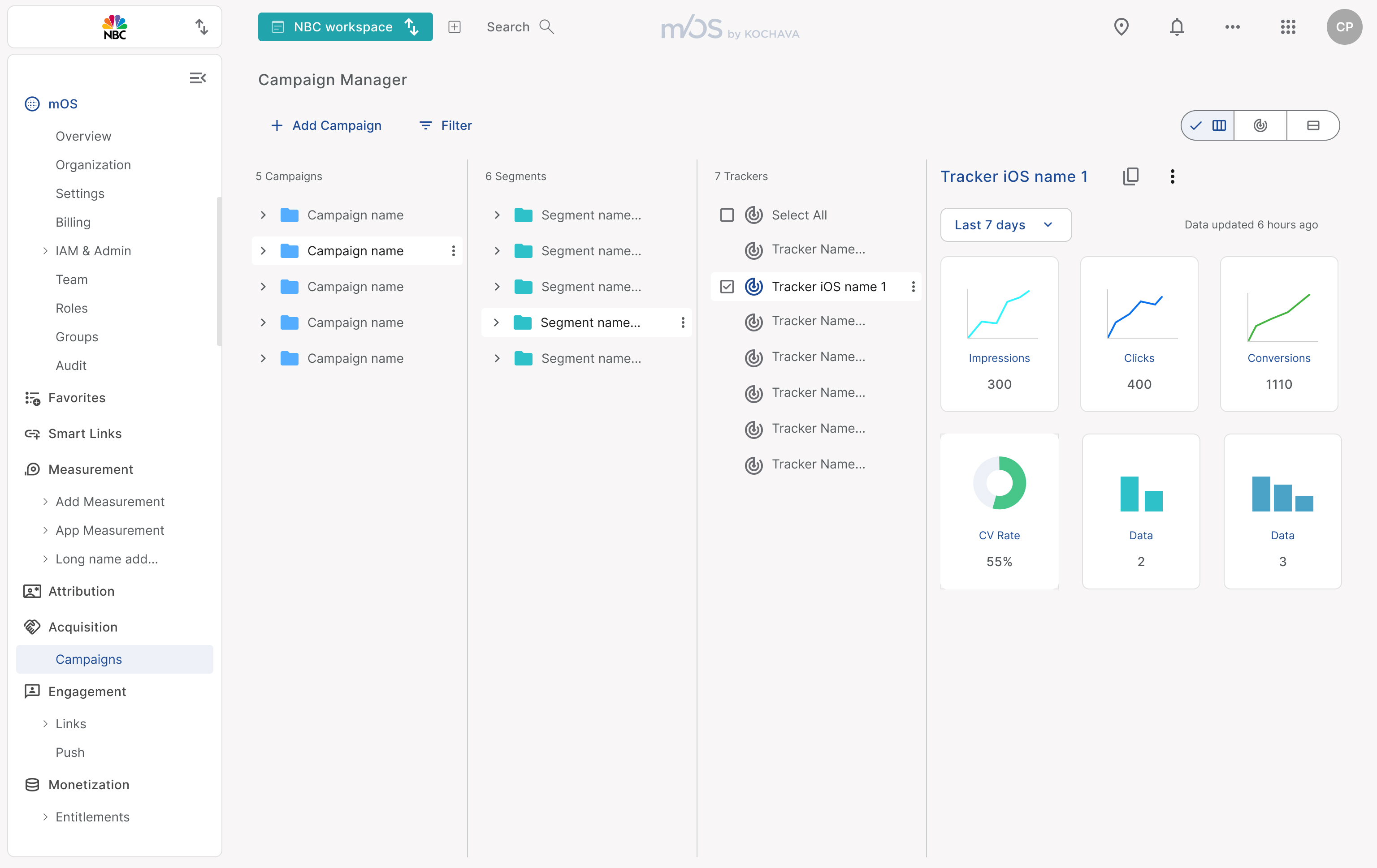
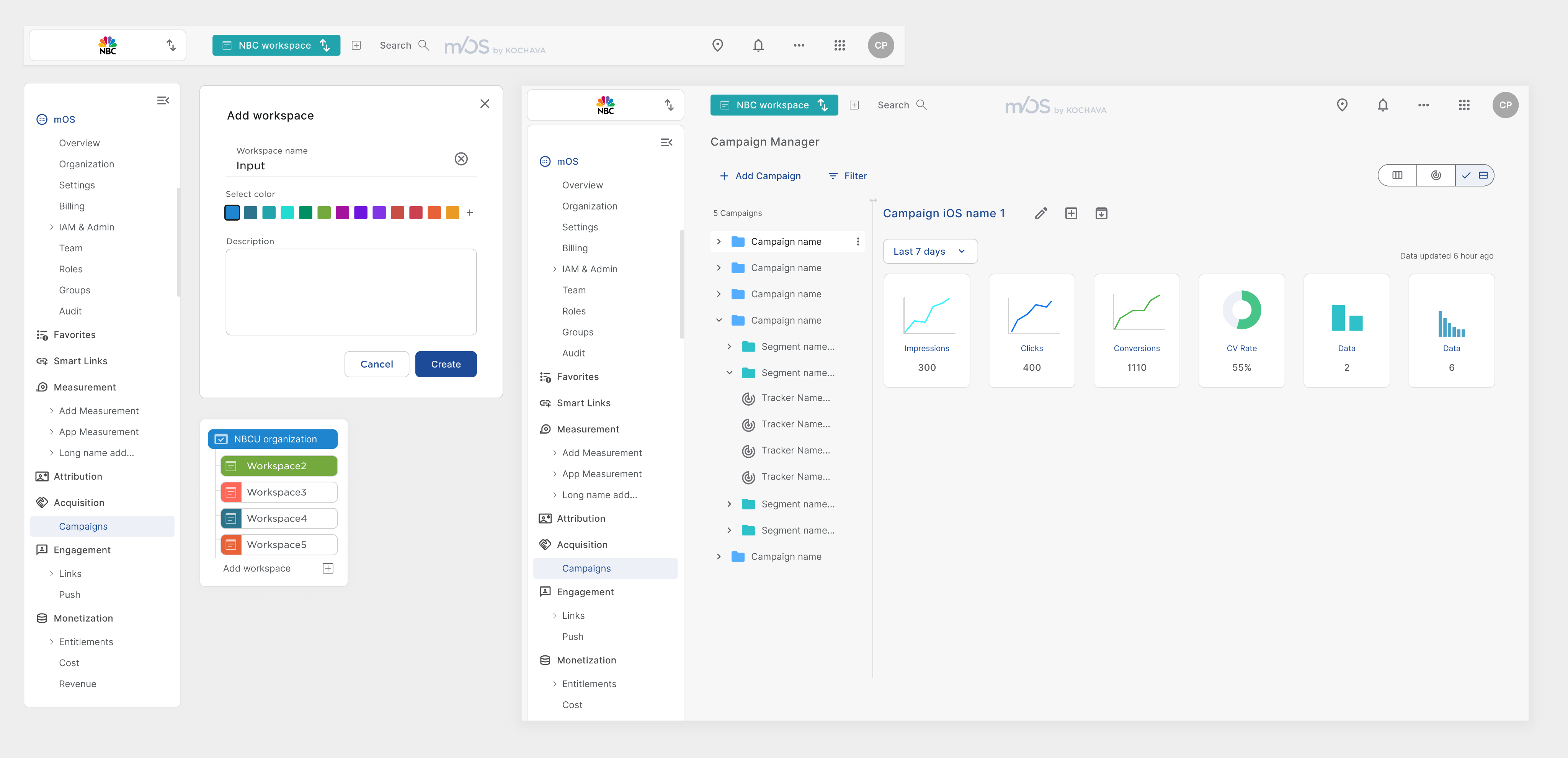
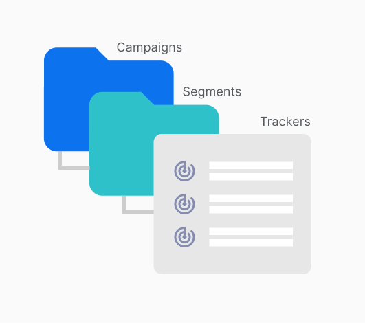
Campaign Organization
Users create campaigns that include segments, which then contain trackers. It’s essential for users to easily create, edit, export, delete, and manage campaigns, segments, and trackers. However, the current table-based interface is overly complex and challenging for users to navigate, making the process more complex than it should be.
Solution
After user interviews and ideation sessions, I proposed a folder-based organizational system where users can create campaigns containing segments, each housing trackers. This structure enables users to efficiently create, edit, delete, and export trackers while accessing analytics for every section. By mirroring how the data is organized on the backend, this approach improves navigation and keeps users within a single screen, eliminating the need to switch back and forth between multiple pages.
Old UI


mOS by Kochava
Kochava is a mobile and connected‑device marketing analytics and attribution platform. It helps advertisers and publishers accurately track the effectiveness of their campaigns across various channels such as mobile apps, CTV, OTT, retail, social media, QR codes, and more.
Scope
Migrate old interface to new branding and design system while enhancing user flows to ease overall process experience.
Problem
Created over a decade ago, this SaaS platform has cultivated a strong and loyal client base. As the application evolved to meet growing customer demands, many sections were created without the guidance of a UX designer, resulting in a fragmented user experience.
Project definition
Customize the design system with the new branding style.
Migrate user features while improving user experience.
Streamline user flows by simplifying navigation and replacing table heavy pages with more dynamic UI processes.
Role
Product designer
User Research, Ideation,
User Experience, Visual Design
Acomplished
- Creation of a style-guide with new branding guidelines.
- Customization of a design system with a new Style-guide.
- Migrating the application in to a new Interface and design system.
- User flows research and analysis.
- User experience design refinement and ideation
Tools and methodology:
- User Journey, personas and user stories.
- Competitive analysis
- Video recording of user interactions with application
- Wire-framing
- Internal User testing
- Triple Diamond Design Process
Highlighted Features

Navigational Structure
In the old interface, had to select an application to work, measure, and view analytics. This approach complicates the user experience and has led to unclear interactions. We propose a new structure where customers log in as an organization. Within this structure, they can create multiple workspaces, each housing different applications. Additionally, organizations can define teams and assign permissions, enabling access to products and features across applications. This holistic perspective removes the limitations of an application-centric approach, streamlining the experience for users.
Add workspace
Select color
Description

Workspace name
Input


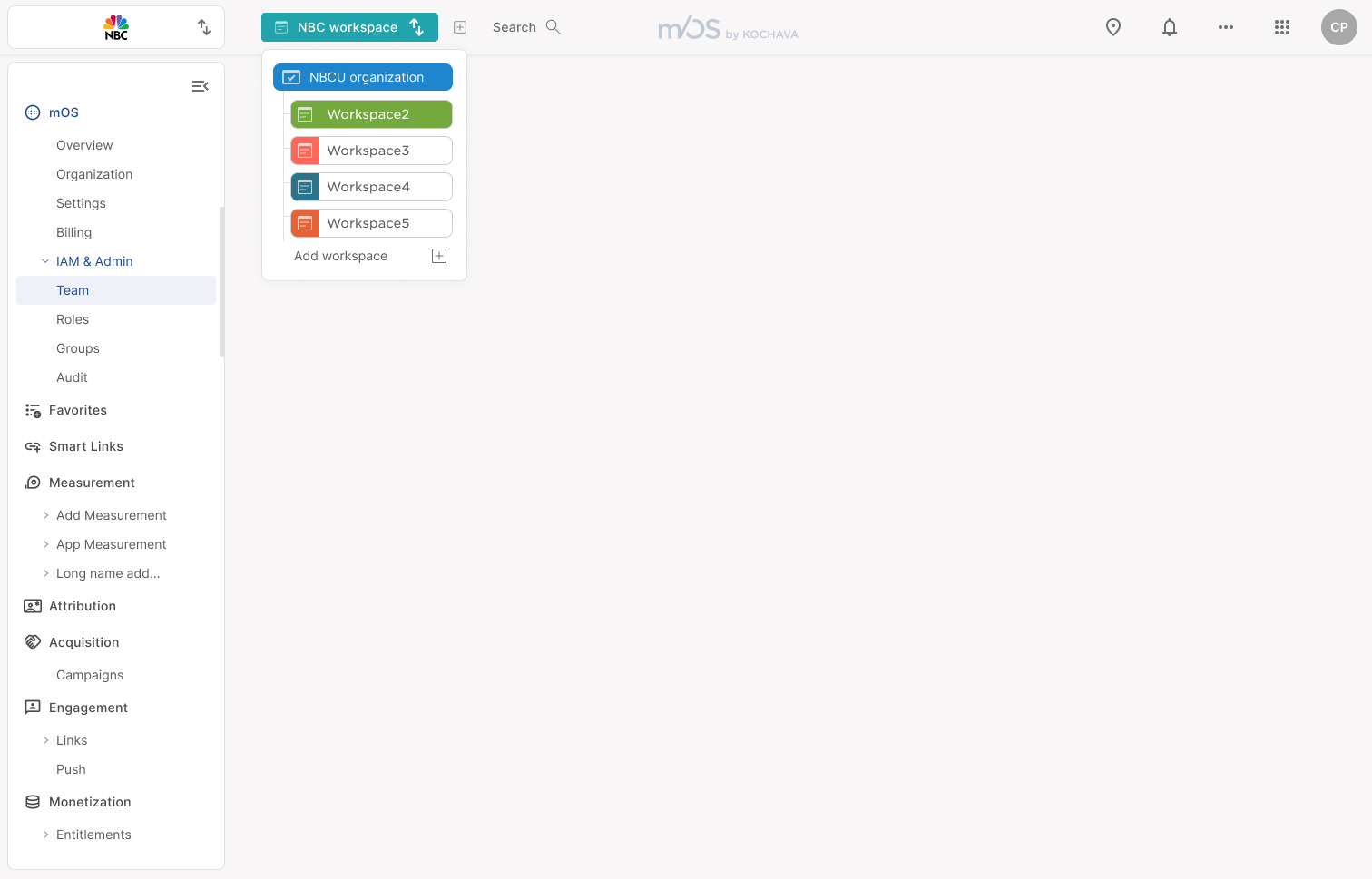
Workspace 1
Workspace 2
Workspace 3
Company configuration
Product 1
Inherited permissions or custom
Company configuration
Product 1
Product 2
Inherited permissions or custom
Company configuration
Product 1
Product 2
Product 3
Inherited permissions or custom

Campaign Organization
Users create campaigns that include segments, which then contain trackers. It’s essential for users to easily create, edit, export, delete, and manage campaigns, segments, and trackers. However, the current table-based interface is overly complex and challenging for users to navigate, making the process more complex than it should be.

Partner Configuration

Conclusions
The application's user experience has improved following an in-depth UX analysis.
Implementing the design system streamlined the adoption of the new branding style guide, while introducing Figma variables easily enabled dark and light mode creation.
User interviews contributed in shaping the ideation process.
Moving away from a table-based navigation system allowed us to introduce more efficient and intuitive UX processes within a single screen.
User testing will be crucial for further refinement, we are planning a customer engagement research project to implement right after GA.
Problem
When adding networks and partners to the system, customers must select a partner from a dropdown list before it is added to a complex table-based structure. The heavy reliance on tables makes navigation complicated, leading to a poor user experience. As a result, customers require step-by-step CSM guidance to successfully add a partner to the application.
Solution
The Apps and Assets section designed allows users to add partners through a streamlined dialog that presents each partner as a card with a logo and name. Users can effortlessly filter and search for partners, making selection intuitive. Once added, partners can be configured, and trackers can be managed all within the same screen eliminating the need to navigate between multiple tables.
Solution
After user interviews and ideation sessions, I proposed a folder-based organizational system where users can create campaigns containing segments, each housing trackers. This structure enables users to efficiently create, edit, delete, and export trackers while accessing analytics for every section. By mirroring how the data is organized on the backend, this approach improves navigation and keeps users within a single screen, eliminating the need to switch back and forth between multiple pages.

Old UI
Old UI
mOS by Kochava
mOS by Kochava
Kochava is a mobile and connected‑device marketing analytics and attribution platform. It helps advertisers and publishers accurately track the effectiveness of their campaigns across various channels such as mobile apps, CTV, OTT, retail, social media, QR codes, and more.
Scope
Migrate old interface to new branding and design system while enhancing user flows to ease overall process experience.
Problem
Created over a decade ago, this SaaS platform has cultivated a strong and loyal client base. As the application evolved to meet growing customer demands, many sections were created without the guidance of a UX designer, resulting in a fragmented user experience.
Project definition
Customize the design system with the new branding style.
Migrate user features while improving user experience.
Streamline user flows by simplifying navigation and replacing table heavy pages with more dynamic UI processes.
Role
Product designer
User Research, Ideation,
User Experience, Visual Design
Team
Product manager, 5 frontend developers,
content strategist, 20 backend developers
and a product designer
Acomplished
- Creation of a style-guide with new branding guidelines.
- Customization of a design system with a new Style-guide.
- Migrating the application in to a new Interface and design system.
- User flows research and analysis.
- User experience design refinement and ideation
Tools and methodology:
- User Journey, personas and user stories.
- Competitive analysis
- Video recording of user interactions with application
- Wire-framing
- Internal User testing
- Triple Diamond Design Process
Highlighted Features

Navigational Structure
In the old interface, had to select an application to work, measure, and view analytics. This approach complicates the user experience and has led to unclear interactions. We propose a new structure where customers log in as an organization. Within this structure, they can create multiple workspaces, each housing different applications. Additionally, organizations can define teams and assign permissions, enabling access to products and features across applications. This holistic perspective removes the limitations of an application-centric approach, streamlining the experience for users.
Add workspace
Select color
Description
Workspace name
Input
CUstomer
Workspace 1
Workspace 2
Workspace 3
Company configuration
Product 1
Inherited permissions or custom
Company configuration
Product 1
Product 2
Inherited permissions or custom
Company configuration
Product 1
Product 2
Product 3
Inherited permissions or custom
Permissions
can be inherited

Campaign Organization
Users create campaigns that include segments, which then contain trackers. It’s essential for users to easily create, edit, export, delete, and manage campaigns, segments, and trackers. However, the current table-based interface is overly complex and challenging for users to navigate, making the process more complex than it should be.
Solution
After user interviews and ideation sessions, I proposed a folder-based organizational system where users can create campaigns containing segments, each housing trackers. This structure enables users to efficiently create, edit, delete, and export trackers while accessing analytics for every section. By mirroring how the data is organized on the backend, this approach improves navigation and keeps users within a single screen, eliminating the need to switch back and forth between multiple pages.
Partner Configuration

Conclusions
The application's user experience has improved following an in-depth UX analysis.
Implementing the design system streamlined the adoption of the new branding style guide, while introducing Figma variables easily enabled dark and light mode creation.
User interviews contributed in shaping the ideation process.
Moving away from a table-based navigation system allowed us to introduce more efficient and intuitive UX processes within a single screen.
User testing will be crucial for further refinement, we are planning a customer engagement research project to implement right after GA.
Problem
When adding networks and partners to the system, customers must select a partner from a dropdown list before it is added to a complex table-based structure. The heavy reliance on tables makes navigation complicated, leading to a poor user experience. As a result, customers require step-by-step CSM guidance to successfully add a partner to the application.
Solution
The Apps and Assets section designed allows users to add partners through a streamlined dialog that presents each partner as a card with a logo and name. Users can effortlessly filter and search for partners, making selection intuitive. Once added, partners can be configured, and trackers can be managed all within the same screen eliminating the need to navigate between multiple tables.
Old UI